Tutorial 004
Displacement Filter in Photoshop
The Displacement Filter in Photoshop is a powerful way to use one image to distort another.
This method of combining two images can help create a seamless illusion.

We’re going to apply a simple graphic and some text to a photo of a metal garage door. The Displacement Filter will make them seem painted on.
1) First gather the images.

The rusted metal garage door is Texture 010 on this website.
The clock graphic is a vector that I created for this tutorial and is available here.
You can use any other simple graphic you wish. Icon fonts like Wingdings are good sources of simple experimental images.
2) Duplicate the garage door image to create a separate file that will become our Displacement Map.
Click on Image>Duplicate and name the new file “Tex 010 Displacement” or something similar.
Displacement maps only use the grayscale information of an image, so we can desaturate our new image and take a look at its black and white values.
Go to Image>Adjustments>Desaturate (keyboard shortcut: Ctrl+Shift+U).
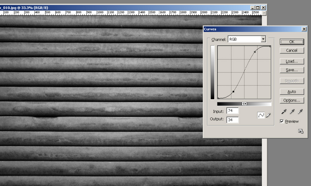
To increase the effect of the displacement map, we will increase the contrast of the image. Open the Curves dialog box from Image>Adjustments>Curves (Ctrl+M) and make an S curve something like the one pictured. This curve darkens the blacks and lightens the whites.
3) Now we will soften our displacement map with some blur.

I used a Gaussian Blur filter (Filter>Blur>Gaussian Blur) with a Radius of 15.
The displacement map is now complete, so save it in a location where we can find it again later.
4) Drag (or Copy/Paste) the clock graphic into the garage door image and position it to one side so there is room for text.
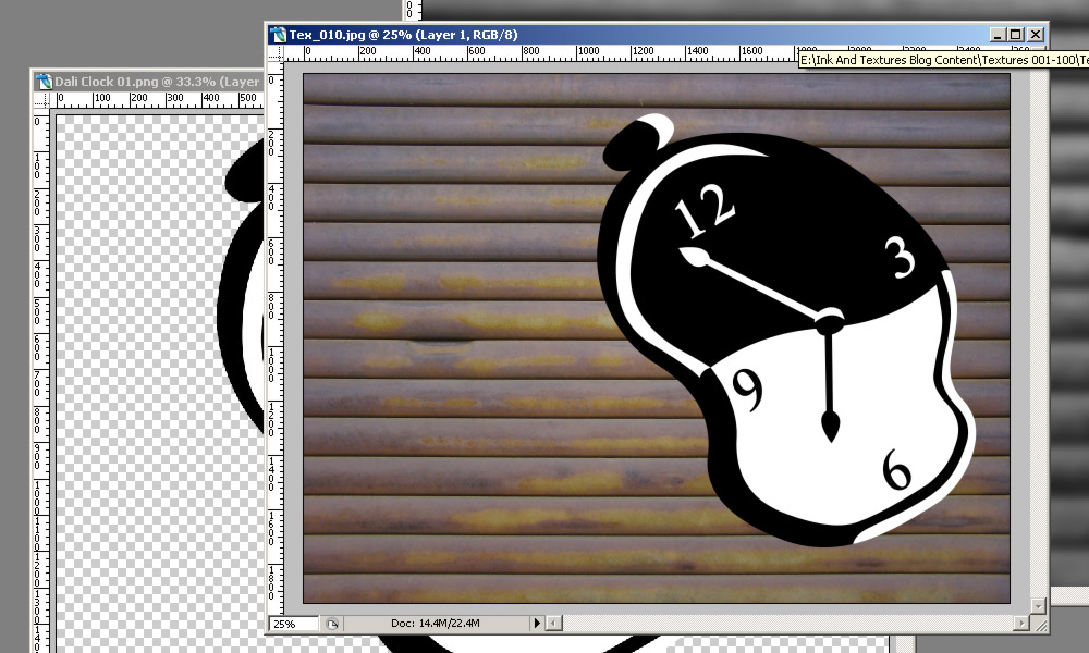
5) With the clock layer selected, go to Filter>Distort>Displace.

Leave both Scale values at 10. You can go back and adjust them later if you don’t get what you want the first time.
Make sure that Stretch to Fit and Wrap Around are selected.
When you click on OK, Photoshop opens your file browser, asking which file you want to use as the displacement map. Navigate to the file that we saved in Step 3.
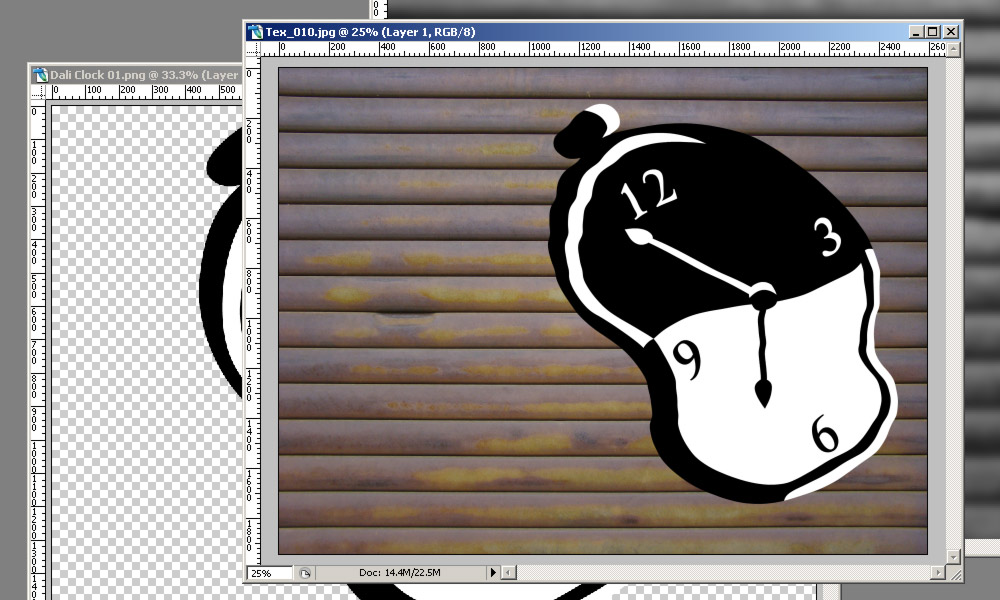
The displacement map distorts the clock, “bending” it according to the light and dark values. The effect may be a bit subtle, but we are going to enhance it in the next steps.
6) Copy the background layer (the garage door) onto a new layer (Layer>New>Layer Via Copy, or Ctrl+J) and move it above the clock graphic.

Desaturate this new layer (Ctrl+Shift+U) and set its Blending Mode to Hard Light in the Layers Palette drop-down box. This adds texture to the layers below, blending the clock with the garage door.
7) We want this new Hard Light layer to affect only the clock layer, so we are going to add a mask. Load the clock graphic layer as a selection by holding down Ctrl and clicking on the layer icon. You can also right-click on the clock layer icon and choose Select Layer Transparency.
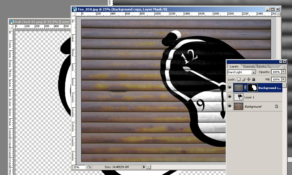
With this selection active, make sure the active layer is the copy of the garage door image (the one we set to Hard Light) and create a mask by going to Layer>Layer Mask>Reveal Selection. You can also do this by clicking on the Add Layer Mask button at the bottom of the Layers Palette.
The Hard Light layer now only affects the clock image, not the garage door.
8) Now we are going to add some text. I used a font called Stencil Standard.
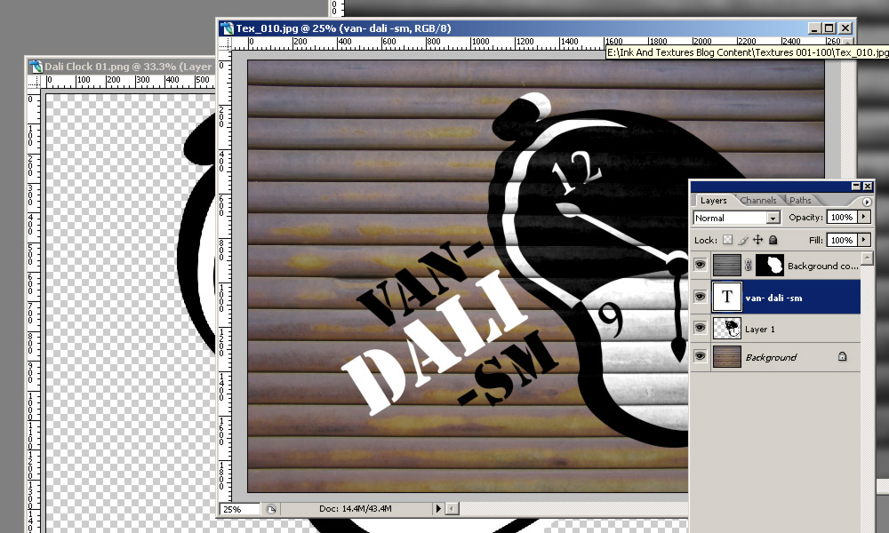
I also made a horrible pun. You don’t have to.
9) We are going to distort the text the same way we distorted the clock. Go to Filter>Distort>Displace… and choose the same options and the same displacement map as before.
Photoshop will ask if you want to rasterize the text before applying the Displacement. Click on “yes”.

10) Now we need to edit the mask on the Hard Light layer so that the blending mode affects the text as well as the clock.

Ctrl+click on the text layer icon to load the selection, then click on the layer mask icon of the Hard Light layer.
It is important that the layer mask icon is selected, not the layer icon (see the green circle in the image above).
Fill the selection with white by right-clicking and selecting Fill…, and then White from the drop-down menu (shortcut: Shift+F5) or you can set your foreground and background colour chips to black and white by hitting the D key and then use Ctrl+Backspace to fill the selection with the Foreground colour.
Your image should look something like this:
You don’t have to stop there, of course. Below is another example with some blur and some more masking to make it look like spray paint.
The drip of paint comes from one of the free inks on this website.

Let me know if this tutorial was useful for you and leave a link to your work in the comments.


Hi, there,
I gave this a whirl and found it to be a cool effect! I had a bit of trouble with my displacement map not lining up with the lines on the metal door, but, I can look into so I will know.
Thank you for this tutorial!
I really like your site and want to say…
…THANK YOU!
Su
Hello Su,
You are very welcome!
I’m really glad you tried the tutorial and that you are getting some use out of the inks and textures.
If you post a link to your displacement image I can try to help you with it.
KIB
Fantastic tutorial and overview, thanks!
Thanks, Mike! Glad it helped you.