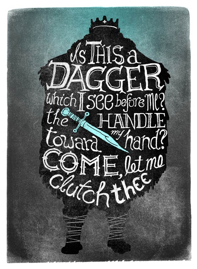
Example 017: Linocut Text

The soft, cloudy texture of Ink 234 gives the appearance of traditional linocut printmaking.
We layered three of the rectangular shapes into a Photoshop document and hand-painted the text onto a Layer Mask.
This quote from Macbeth just seemed to match the dark, spooky atmosphere suggested by the texture.
A little colour tint to the dagger and around his head underlies the hallucination that becomes his undoing.


How awesome! Did you use fonts, or how did you do the texting? THAT is what makes it so cool! I have a Linocut set of Illustrator brushes I have yet to try! I should!
Cool image!
Su
Thanks, Su! We improvised all the fonts free-hand, guided by the text and mood of the whole piece.
Linocut brushes for Illustrator sound really cool. These textures would be a great starting point for experimenting with them!
Yeah, this looked pretty much like free hand job. Which is terrific, of course. Really great work, congratulations! It’d make a great poster.
Thanks, Matt! Had a lot of fun with this one. Those soft ink rectangles are great to work with.
Well, it is certainly neat looking! I’m impressed! It WOULD make a great poster!
Thanks for the response!
Su